A 2022 Guide to Cutting-Edge Trends & Tips
Welcome to the new year! As we step into 2022, it’s the perfect time to explore the upcoming trends, set goals and resolutions, and plan for a year of achievements and success. In the rapidly evolving world of web design, staying ahead of the curve is crucial to seize the opportunities and overcome the challenges that lie ahead.
In this comprehensive guide, we will delve into the top trends and tips that will shape the web design landscape in 2022. From captivating graphic design trends to innovative website creation tips, we have curated a collection of insights and inspiration to empower you on your digital journey.
Whether you are a seasoned web designer or a business owner with a website to revamp, this guide will equip you with the knowledge and tools to create cutting-edge designs that captivate your audience and drive success.
Key Takeaways:
- Stay ahead by embracing the latest graphic design trends, including the comeback of serifs and high-contrast weights.
- Optimize your web design for mobile devices with thumb-friendly navigation, ensuring an intuitive and seamless user experience.
- Explore the power of vertical videos to engage your audience on social media platforms and cater to the dominance of mobile browsing.
- Add warmth and personality to your designs with friendly geometrics, incorporating warm colors and curves.
- Stand out from the crowd with asymmetrical layouts, breaking the mold and infusing creativity into your website design.
2022 is the year to unleash your creativity and take your web design to new heights. Are you ready to embrace the future of design? Let our guide be your compass as you navigate the world of cutting-edge trends and tips.
Graphic Design Trends: Serifs Make a Comeback
The graphic design industry is abuzz with the resurgence of serifs in 2022. While minimalism continues to dominate the design landscape, the introduction of ornamental serifs is gaining traction among designers and brands alike. The use of elegant serif fonts adds a touch of sophistication and class to visual identities, allowing brands to make a lasting impression.
One notable sub-trend within the serif revival is the adoption of high-contrast weights. By combining thinner and bolder strokes, designers create visually dynamic text that demands attention. This technique adds a sense of elegance and drama, making the words on the page come alive.
If we take a closer look at popular brands today, we can see how serifs are being used to evoke a sense of tradition, professionalism, and reliability. Serif fonts convey a strong visual presence and are particularly effective for conveying trustworthiness and authority. By incorporating serifs in their branding and marketing materials, companies can establish a connection with their target audience and enhance their brand perception.
“The use of serif fonts in graphic design has the power to elevate brands, infusing them with a timeless elegance and sophistication.”
However, serifs are not limited to traditional applications. Designers are also experimenting with unique combinations of serifs and other design elements to create striking visual identities. By blending serifs with modern aesthetics or incorporating them into abstract compositions, brands can achieve a balanced and appealing design that stands out from the crowd.
In order to illustrate the impact of serifs in graphic design, let’s take a look at two contrasting examples:
| Brand A | Brand B |
|---|---|
| Brand A utilizes a bold serif font in their logo, creating a strong and authoritative presence. The use of high-contrast weights adds visual interest and draws attention to key elements. | Brand B takes a more minimalistic approach by incorporating delicate serifs in their typography. The result is an elegant and refined design that exudes sophistication. |
As we can see from these examples, serifs can be applied in various ways to achieve different design goals. Whether it’s to make a bold statement or convey a sense of elegance, serifs have the versatility to enhance brand identities and create memorable visual experiences.
The Impact of Serifs on Branding
Serifs have a significant impact on the overall perception of a brand. Here are some key reasons why designers are embracing serif fonts in their work:
- Enhanced Legibility: Serif fonts are widely known for their readability, making them an excellent choice for both print and digital media.
- Elevated Aesthetic: The addition of serifs adds a touch of sophistication and class to visual identities, elevating a brand’s overall aesthetic.
- Established Tradition: Serifs are deeply rooted in typographic history, and their use can establish a connection to established traditions and values.
With the resurgence of serifs and the creative ways they are being incorporated into design, we can expect to see brands embracing this trend to create compelling visual identities in 2022 and beyond.
Mobile-Friendly Web Design: Thumb-Friendly Navigation
As mobile browsing continues to rise, web designers are prioritizing mobile-friendly web design with a focus on thumb-friendly navigation. To enhance user experience, navigation elements are strategically placed at the bottom of mobile sites and apps, allowing for easier and more intuitive thumb navigation. This approach ensures that users can effortlessly navigate through the website using their thumbs, without having to stretch or adjust their grip.
This design trend takes into consideration the natural ergonomics of how users hold and interact with their mobile devices. By optimizing for thumb navigation, web designers are streamlining user interactions and making it more convenient for users to explore websites using just one hand.
Intuitive usability is at the core of this mobile-friendly web design trend. By placing navigation elements within easy reach of the thumb, users can navigate through menus, scroll through content, and access important functions with ease. This not only enhances the overall user experience but also contributes to increased engagement and longer browsing sessions.
Thumb-friendly navigation is one of the key elements of mobile-friendly web design in 2022. It ensures that users can seamlessly explore websites on their mobile devices, providing a smooth and enjoyable browsing experience. By prioritizing intuitive usability, web designers can create websites that are not only visually appealing but also highly functional on mobile platforms.
| Benefits of Thumb-Friendly Navigation | Examples |
|---|---|
| Improved user experience | Mobile apps with bottom navigation bars |
| Effortless thumb navigation | Websites with sticky navigational elements at the bottom |
| Increased engagement | Single-handed operation on smartphones |
| Convenient access to key functions | Mobile sites with thumb-friendly menus and buttons |
Video Content: The Rise of Vertical Videos
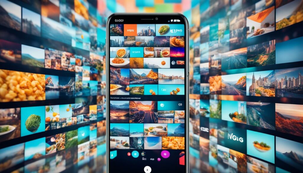
In today’s digital landscape, video content has taken the social media world by storm. As more people consume content on their mobile devices, the demand for video experiences that are optimized for mobile viewing is on the rise. This has paved the way for the emergence of vertical videos as a popular trend.
Vertical videos are specifically tailored to be viewed on mobile devices in a vertical or portrait orientation. This format is well-suited for social media platforms that prioritize mobile-friendly content, such as Snapchat and Instagram Stories. The vertical orientation allows users to fully engage with the video without needing to rotate their device, offering a seamless and immersive viewing experience.
One of the main advantages of vertical videos is that they take up the entire screen, maximizing visual impact and capturing the viewer’s attention. Brands and content creators are embracing this format to tell captivating stories, showcase products, and connect with their audience in a more intimate way.
Mobile-friendly videos are essential for brands looking to expand their reach and engagement on social media platforms. By optimizing video content for vertical viewing, brands can ensure that their message is delivered in a visually compelling manner that resonates with their target audience.
“Vertical videos are a game-changer for brands seeking to make a splash on social media. By taking advantage of the vertical format, brands can create unique and engaging content that stands out from the crowd.”
Furthermore, the rise of vertical videos has extended beyond social media platforms and into mainstream channels. Major video platforms like YouTube and Vimeo have also recognized the value of vertical videos, allowing creators to upload and showcase their content in this format. This shift demonstrates the increasing importance of mobile-centric content and the need for brands to adapt their video strategies accordingly.
In conclusion, the rise of vertical videos has revolutionized the way we consume video content on mobile devices and social media platforms. Brands that embrace this trend have the opportunity to connect with their audience in a more immersive and engaging way. By creating mobile-friendly videos optimized for the vertical format, brands can stay ahead of the curve and leverage the power of video to drive their marketing efforts.
Friendly Geometrics: Adding Warmth to Geometric Designs
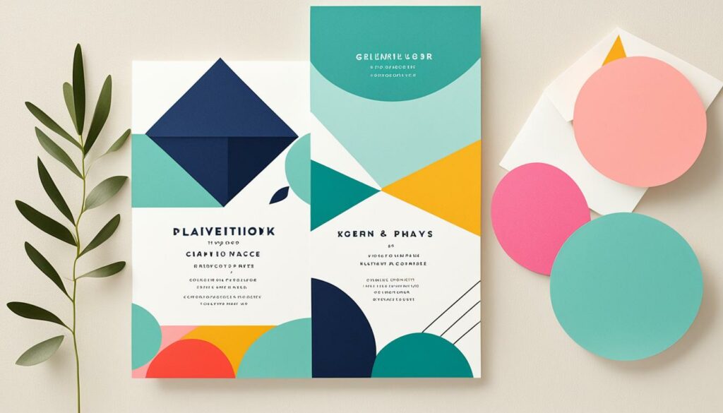
Geometric designs have been steadily gaining popularity in recent years. However, to avoid the stark and impersonal feel often associated with geometric shapes, designers are now incorporating warm colors and curves into their creations. This trend adds a touch of inviting warmth and humanizes the geometric designs, making them more relatable to a wider audience.
By infusing friendly geometrics with warm colors, such as soothing earth tones or vibrant hues, the designs evoke a sense of comfort and familiarity. These warm colors create a welcoming atmosphere and help establish an emotional connection with users. Pairing geometric shapes with warm colors creates a harmonious balance between structure and visual appeal.
In addition to warm colors, the use of curves in geometric designs adds an organic and playful element. Curves soften the rigid edges of geometric shapes, giving them a more approachable and friendly appearance. The incorporation of curves can be seen in various aspects of a design, from the outlines of shapes to the typography and patterns used.
This trend of adding warmth to geometric designs strikes a delicate balance between structure and whimsy. It allows for the creation of visually engaging and visually stimulating designs that cater to a broader audience. Whether it’s a website, logo, or any other design element, embracing friendly geometrics with warm colors and curves offers a fresh and inviting visual experience.
“By infusing warm colors and curves into geometric designs, designers can strike a balance between structure and whimsy, resulting in visually engaging creations that appeal to a wider audience.”
Why Friendly Geometrics Matter
- Visual Appeal: Warm colors and curves in geometric designs make them visually appealing and visually stimulating, capturing attention and creating a memorable impression.
- Emotional Connection: The use of warm colors and curves helps establish an emotional connection with users, making them feel welcome and comfortable.
- Versatility: Friendly geometrics can be applied to various design elements, including websites, logos, packaging, and more, allowing for consistent and cohesive brand representation.
- Increased Engagement: Designs that incorporate friendly geometrics are more likely to evoke curiosity, interest, and engagement from users, leading to increased interaction and conversions.
Examples of Friendly Geometrics in Action
| Website | Logo | Print Design |
|---|---|---|
As seen in the examples above, friendly geometrics bring warmth and life to different design contexts. The combination of warm colors, curves, and geometric shapes creates visually striking and approachable designs that leave a lasting impression. Whether it’s a website, logo, or print design, incorporating friendly geometrics adds a touch of personality and appeal that resonates with audiences.
Embracing Asymmetry: Standing Out with Unconventional Layouts
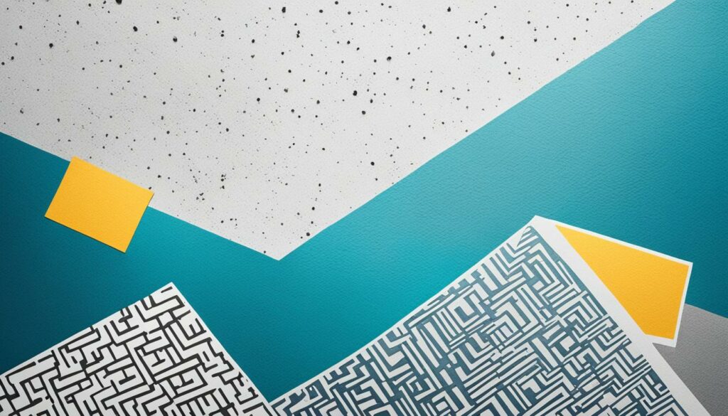
Asymmetrical layouts are revolutionizing the world of web design, allowing designers to break free from the confines of traditional templates and create visually stunning compositions. By embracing asymmetry, web designers can inject an edgy and creative flair into their websites, making them stand out from the crowd.
Traditionally, web designs have followed symmetrical patterns, with balanced elements placed in predictable positions. However, asymmetrical layouts challenge this norm by deliberately placing elements in off-center or unexpected locations. This intentional irregularity adds a sense of uniqueness and dynamism to the design, capturing users’ attention and encouraging them to explore further.
Breaking the mold with asymmetrical layouts opens up endless possibilities for experimentation and creativity. By taking risks and defying conventional norms, designers can create truly innovative and memorable web experiences. Whether it’s playing with varying sizes, overlapping elements, or using unconventional angles, asymmetry allows designers to push boundaries and craft layouts that leave a lasting impression.
When executed effectively, asymmetrical layouts can enhance the visual hierarchy of a website by guiding the user’s focus to key elements or content. By strategically placing asymmetrical design elements, such as images, headlines, or calls to action, designers can create a path that leads users through the website and highlights important information.
Benefits of Asymmetrical Layouts
Why should web designers consider embracing asymmetry? Here are some of the key benefits:
- Captivating and Unique: Asymmetrical layouts stand out in a sea of symmetrical designs, making a bold statement and leaving a lasting impression on users.
- Creative Expression: Breaking free from rigid templates allows designers to express their creativity and showcase their unique design aesthetics.
- Visual Interest: Asymmetry adds visual interest and dynamism, captivating users and encouraging them to explore the design further.
- Flexible and Adaptive: Asymmetrical layouts can adapt to different screen sizes and resolutions, providing a seamless experience across devices.
“Asymmetrical layouts offer designers the freedom to break free from the mold and create captivating and unique web experiences that stand out in the digital landscape.”
While asymmetrical layouts offer immense creative possibilities, it’s important to strike the right balance between asymmetry and usability. Careful consideration should be given to maintaining a clear and intuitive navigation flow, ensuring that users can easily find the information they’re seeking.
Asymmetrical layouts have become an influential trend in web design, allowing designers to challenge conventions and create visually stunning websites that break away from the norm. With the power to captivate users and leave a lasting impression, asymmetrical layouts are undoubtedly a powerful tool in the arsenal of forward-thinking web designers.
Futuristic Imagery: The Power of 3D

The advancements in technology have paved the way for realistic 3D imagery. This trend allows designers to create visually stunning and immersive experiences. From abstract shapes to typography, 3D imagery adds a futuristic touch to web design in 2022.
| Benefits of 3D Imagery | Examples |
|---|---|
| 1. Enhanced visual impact | |
| 2. Ultra-realistic visuals | |
| 3. Increased user engagement |
Why Choose 3D Imagery?
- Immersive visualization: 3D imagery allows users to interact with products, spaces, or concepts in a dynamic and engaging way.
- Realistic representation: The ultra-realistic visuals created by 3D imagery provide a lifelike experience, enhancing the perception of quality and attention to detail.
- Unlimited creativity: With 3D imagery, designers have the freedom to experiment with shapes, textures, and perspectives, pushing the boundaries of traditional design.
- Memorable user experience: The futuristic design created by 3D imagery leaves a lasting impression on users, making websites stand out from the competition.
“3D imagery allows brands to showcase their products or services in a visually captivating way, leaving a lasting impression on their audience.”
– Jane Smith, Design Expert
Personalized Typography: Custom Fonts Take Center Stage
When it comes to creating a strong brand identity, every detail matters. In the world of web design, fonts play a crucial role in capturing the essence of a brand. In 2022, personalized typography is taking center stage, allowing brands to stand out and leave a lasting impression on their audience.
Custom fonts are gaining popularity as designers seek to create a unique visual identity for each brand. From handwritten fonts to loopy cursive fonts and blocky outline fonts, there are endless possibilities for personalized typography. These fonts not only add a touch of personality but also help brands differentiate themselves in a crowded digital landscape.
Handwritten fonts, with their organic and imperfect feel, evoke a sense of authenticity and creativity. They add a personal touch and can make the text feel more approachable and relatable. Whether it’s a quirky script or elegant calligraphy, handwritten fonts bring a sense of warmth and uniqueness to a website.
Loopy cursive fonts, with their elegant curves and flourishes, exude sophistication and charm. They can add a sense of luxury and refinement to a brand’s visual identity. These fonts are often used for headings, logos, and branding elements, creating an air of elegance and exclusivity.
Outline fonts, characterized by their bold and blocky shapes, bring a touch of modernity and edginess to web design. They create a strong visual impact and make a statement. Outline fonts are often used for titles and headlines, making them pop and grabbing users’ attention.
By leveraging personalized typography, brands can create a cohesive and memorable visual experience for their audience. Whether it’s through handwritten fonts, loopy cursive fonts, or blocky outline fonts, custom fonts allow brands to communicate their unique personality and values.
Let’s take a look at some examples of personalized typography in action:
“Our custom handwritten font adds a personal touch to our brand and resonates with our audience, making them feel like they’re part of our story.” – Emily Johnson, Founder of Wanderlust Adventures
With personalized typography, brands have the power to make a lasting impression and create a visual identity that stands out. Whether it’s through handwritten fonts, loopy cursive fonts, or blocky outline fonts, custom fonts add a touch of uniqueness and help brands establish their distinctive voice in the digital realm.
Elaborate Detailing: Adding Intricacy to Web Designs
Elaborate detailing is a captivating trend that elevates the complexity and depth of web designs. By incorporating techniques such as line shading and photorealism, designers create visually stunning visuals that capture users’ attention and immerse them in the digital experience.
Line shading, a technique that uses varying line weights and patterns, adds dimension and texture to web designs. It creates a sense of depth and intricacy, making elements pop and stand out. This technique can be incorporated into backgrounds, illustrations, and typography, giving websites an artistic touch.
Photorealism takes web design to a whole new level by bringing real-world objects and scenes to life on digital platforms. By meticulously rendering details, shadows, and textures, designers achieve a level of realism that blurs the line between digital and reality. Photorealistic elements can be seamlessly integrated into product images, hero banners, or even entire website backgrounds, creating an immersive and engaging user experience.
This trend pairs exceptionally well with hand-drawn illustrations. The combination of intricate line work and photorealistic elements adds a unique blend of artistry and realism to web designs. It allows brands to convey their message and evoke emotions in a visually appealing and memorable way.
“Elaborate detailing brings designs to life, evoking emotions and creating memorable experiences.”
Benefits of Elaborate Detailing in Web Design
The use of elaborate detailing in web design offers several benefits:
- Enhanced Visual Appeal: Elaborate detailing adds a touch of sophistication and visual interest to web designs, making them stand out from competitors.
- User Engagement: Intricate visuals and realistic elements capture users’ attention and keep them engaged, increasing the time spent on a website.
- Brand Differentiation: Elaborate detailing allows brands to differentiate themselves and showcase their unique identity through visually stunning designs.
- Memorable User Experience: Intricate details and realistic visuals create a memorable user experience, leaving a lasting impression on visitors.
Emphasizing Elaborate Detailing in Web Design
To emphasize elaborate detailing in web design, consider the following:
- Focus on Typography: Incorporate detailed typography by experimenting with elaborate letterforms, ornate scripts, or even custom typefaces. This adds an element of refinement and uniqueness to the overall design.
- Create Intricate Patterns: Integrate intricate and visually appealing patterns into backgrounds or design elements. Exploring geometric, floral, or abstract patterns can add depth and visual interest to the overall composition.
- Layer Textures and Effects: Combine different textures and effects, such as grunge, metallic, or glass, to add depth and complexity to design elements. This technique adds a tactile and realistic feel to the user experience.
- Balance Complexity and Usability: While elaborate detailing adds visual interest, it’s important to maintain a balance between complexity and usability. Ensure that the intricate elements do not hinder functionality or distract users from the main content.
Elaborate detailing brings digital designs to life, captivating users with its intricate line work, photorealistic visuals, and artistic touch. By incorporating elaborate detailing into web design, brands can create visually stunning websites that stand out, engage users, and leave a lasting impression.
Vintage Logos: Nostalgia Meets Authenticity
Vintage logos have become a staple choice for brands aiming to establish authenticity and evoke a sense of history. By incorporating elements like circular frames, established years, and weathered textures, brands can create a nostalgic and timeless look that resonates with their audience.
With a vintage logo, brands can instantly convey a rich heritage and imply a successful history. The circular frame not only adds a distinct visual appeal but also symbolizes unity and continuity. It encapsulates the brand’s story within a timeless boundary.
Creating Weathered Textures
To further enhance the vintage feel, weathered textures can be added to the logo design. These textures mimic the appearance of aging and wear, adding depth and character to the logo. It creates a sense of authenticity and nostalgia by capturing the imperfections that come with the passage of time.
“Vintage logos allow brands to tap into the emotional power of nostalgia while establishing themselves as longstanding and trustworthy.”
Weathered textures can be achieved through various techniques, such as distressed effects, vintage grain overlays, or faded color palettes. Each method adds a unique touch to the logo design, bringing it to life with a weathered charm.
Timeless Appeal
One of the key advantages of vintage logos is their timeless appeal. They transcend temporary design trends and remain relevant for years to come. By evoking a sense of nostalgia, these logos can establish an emotional connection with customers, creating a lasting brand identity.
Whether it’s a classic automobile brand or a rustic coffee shop, vintage logos have the power to transport customers to a bygone era and evoke sentiments of authenticity and trust.
A Noteworthy Example: Coca-Cola’s Vintage Logo
A prime example of a successful vintage logo is Coca-Cola’s iconic script logo, with its circular frame, weathered textures, and established year. The logo has remained virtually unchanged for over a century, consistently invoking a sense of nostalgia and reliability.
“Coca-Cola’s vintage logo is a testament to the enduring appeal and effectiveness of a well-crafted vintage design.”
The use of vintage logos allows brands to stand out from the crowd and establish a unique brand identity rooted in tradition and authenticity. It’s a powerful design choice that captures the essence of a brand’s history and resonates with customers on an emotional level.
| Advantages of Vintage Logos | Notable Examples |
|---|---|
|
|
The Power of Duotone Gradients
In the ever-evolving world of web design, incorporating innovative techniques can bring a unique look and feel to your website. One such trend that has gained popularity in recent years is the use of duotone gradients. By blending two contrasting colors together, designers can create visually striking and distinctive looks that captivate users.
What exactly are duotone gradients? They involve reducing an image to two contrasting colors and seamlessly fading them into each other. This creates a visually rich and dynamic effect that adds depth and dimension to your website. The use of contrasting colors enhances the overall impact and allows for greater emphasis on important elements.
“By implementing duotone gradients, websites can achieve a modern and stylish aesthetic while maintaining a visually cohesive and engaging user experience.”
Contrasting colors play a crucial role in creating a duotone gradient. When selecting colors, consider their vibrancy, saturation, and how they complement each other. Experiment with different combinations to find the perfect balance that aligns with your brand image.
What makes duotone gradients so powerful is their ability to transform ordinary images into extraordinary visuals. By applying this technique, ordinary photographs can be given a fresh, contemporary look that captures attention and sparks curiosity.
Benefits of Duotone Gradients:
- Unique Look: Duotone gradients create a distinctive visual style that sets your website apart from the competition.
- Attention-Grabbing: The bold use of contrasting colors instantly grabs users’ attention and directs it towards important elements.
- Enhanced Visual Appeal: The seamless blending of colors adds depth, dimension, and a modern feel to images.
- On-Brand Aesthetics: Duotone gradients allow you to incorporate your brand colors and maintain a consistent visual identity throughout your website.
Embracing duotone gradients in your web design can transform your website into a visually engaging and unforgettable experience for users. By leveraging this trend, you can create a unique look that captivates visitors and leaves a lasting impression.
| Duotone Gradients in Action |
|---|
Conclusion
In 2022, the world of web design is embracing a variety of cutting-edge trends. From the resurgence of serifs to thumb-friendly navigation and futuristic 3D imagery, web designers are pushing boundaries and creating stunning visuals. By incorporating these trends and tips into your website, you can stay ahead in the ever-evolving digital landscape.
The resurgence of serifs in graphic design adds a touch of sophistication and elegance to brands, while thumb-friendly navigation enhances the user experience on mobile devices. Futuristic 3D imagery creates visually immersive experiences, and personalized typography allows brands to add a unique touch to their websites.
Adding warmth to geometric designs and embracing asymmetrical layouts help websites stand out and capture users’ attention. Elaborate detailing and vintage logos bring complexity, depth, and nostalgia to web designs. Duotone gradients create visually striking and distinctive looks, making websites more engaging.
By keeping up with these cutting-edge trends and incorporating them into your web design, you can create stunning visuals and stay ahead of the competition. Embrace the future of web design in 2022 and make your website a standout in the digital landscape.
FAQ
What are some current graphic design trends for 2022?
In 2022, the graphic design industry is seeing a resurgence of serifs. Minimalism still dominates, but ornamental serifs are gaining popularity, adding sophistication and class to brands. High-contrast weights are also trendy, creating visual dynamics in text.
How can I create a mobile-friendly website?
To make your website mobile-friendly in 2022, focus on thumb-friendly navigation. Place navigation elements at the bottom of mobile sites and apps to allow for easier and more intuitive thumb navigation. This trend improves the user experience and ensures your website is mobile-friendly.
Why are vertical videos becoming more popular?
Vertical videos are gaining popularity due to the dominance of mobile devices and social media platforms. Popular platforms like Snapchat and Instagram Stories have popularized vertical videos, and now even mainstream channels are adopting this trend. Vertical videos provide a unique and engaging viewing experience, especially on mobile devices.
How can I add warmth to geometric designs?
To add warmth to geometric designs in 2022, incorporate warm colors and curves. By using warm colors and adding curves to your geometric designs, you can make them more inviting and less impersonal. This trend strikes a balance between structure and whimsy, appealing to a wider audience.
What is an asymmetrical layout and why is it popular?
An asymmetrical layout is a layout that breaks the mold and offers unique and visually stimulating compositions. It is gaining popularity in web design as designers aim to stand out from the crowd. When done well, asymmetrical layouts can add an edgy and creative flair to a website.
How can I incorporate realistic 3D imagery in web design?
In 2022, advancements in technology have paved the way for realistic 3D imagery in web design. Designers can use 3D imagery to create visually stunning and immersive experiences. From abstract shapes to typography, 3D imagery adds a futuristic touch to web design.
What is the trend in typography for 2022?
Custom fonts are gaining popularity in 2022. Handwritten fonts, loopy cursive fonts, and blocky outline fonts are some of the trends in personalized typography. These fonts add a unique touch to websites and help brands stand out.
How can I add intricate details to my web designs?
Elaborate detailing is a trend that adds complexity and depth to web designs. Techniques like line shading and photorealism create visually stunning visuals that capture users’ attention. This trend pairs well with hand-drawn illustrations, adding a touch of artistry to web design.
Why are vintage logos popular?
Vintage logos are a popular choice for brands looking to establish authenticity and convey a sense of history. By incorporating elements like circular frames, established years, and textured overlays, brands can create a nostalgic and timeless look. Vintage logos are a shortcut to implying a successful history.
What is the trend in duotone gradients?
The combination of duotone techniques and gradients has given rise to a new trend in web design. By reducing an image to two contrasting colors and fading them into each other, designers can create visually striking and distinctive looks. This trend adds an element of interest and uniqueness to websites.
